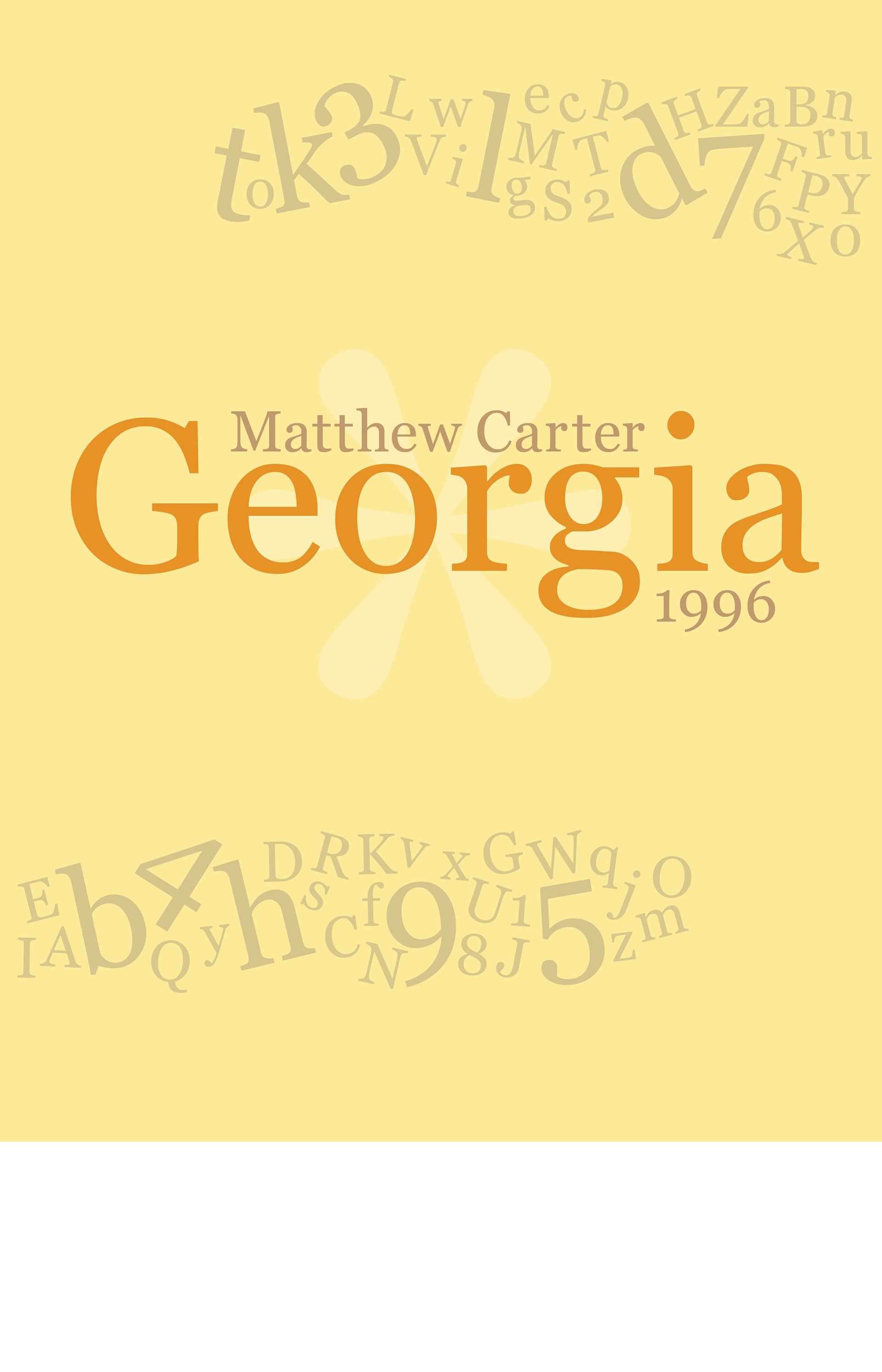
This piece was designed in response to an assignment where I had to embody a typeface in a poster. I was randomly assigned Georgia, and fast fun facts, Georgia is the most legible on-screen serif font for screens (its partner is Verdana for sans-serif). It's known for its playful numbers that do not follow the baseline. Here, I tried to capture that playfulness.